eMazing 10 commandments for converting primary image/ How to have the best converting Primary image on Amazon:
-
White pixels do not sell
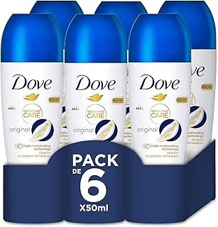
Avoid having too much white. If your product or your packaging is originally white, it will not be very visible on the results page since the Amazon results page fills in empty space with … white. If you are in such a situation, find a way to create color contrast/ shade. In the example below from Amazon, Dove, which is predominantly a white brand, uses the cap and a virtual “shelf wrapper” to introduce blue and dark blue as a way to create colors and attract the eyes
-
Size matters (the larger the better)
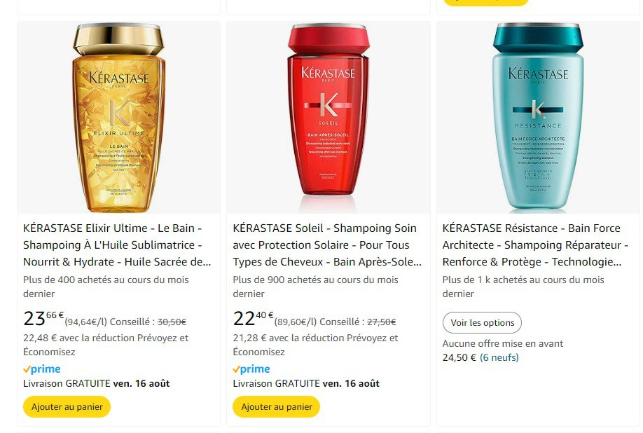
Connected to the previous point, the primary uploaded image should look as tall as possible and reduce the white margins, otherwise the product will look comparatively smaller vs the competition. In the picture below from Amazon the 3 products are in reality the same size. Still, because the 2nd one has some margin below the product, it looks relatively smaller vs the other 2 and makes the primary image and product less visible and attractive.
-
Attract the eyes with contrasting colors
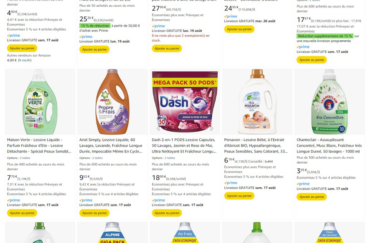
When shoppers look at the results page, you need a way to implicitly and explicitly attract their eyes to be considered. Explicitly, it will be because of your brand, what features your product has and what competition does not, and because of the price…. Implicitly is about making your product visible. If your product evolves in a category where most products use dull colors; using vivid colors will make your primary image more visible and increase the chance of being opened. The example below from Amazon shows that most primary images of the detergent category use green or white colors. Dash, with its very pink and vivid colors, immediately attracts the eyes and makes it more visible than the other primary images on the page.
-
Understand the category visual cues…
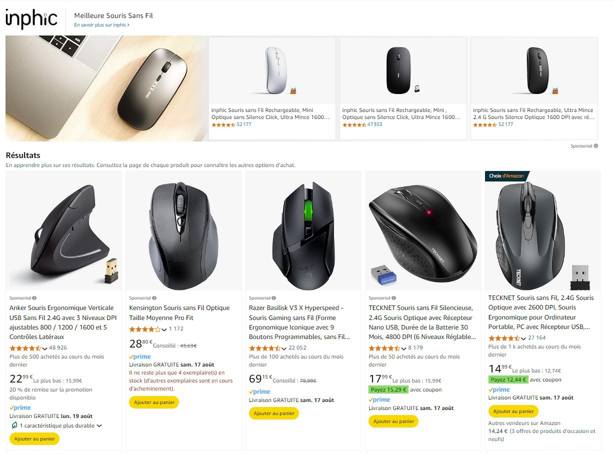
It is important not to be immediately deselected to understand if your product`s category needs to offer reassurance on a crucial benefit or feature your product needs to have. In our past projects, we realized some clients believed having this additional element on the product page would be enough to make their product attractive. This way of thinking forgets that a product page needs to be opened for people to go through it, and if the product is not deemed attractive, the product will not be opened. Thus, it is critical to bring these expected visual cues to the primary image (of course not all categories have one) In the picture below taken from Amazon, we see that on this wireless mouse search, most products have a small usb transmitter next to the mouse, not having one looks like a disturbing factor and can be a reason for the product page not to be opened
-
…but find a way to distinguish your primary image versus the other competitive products appearing on the results page
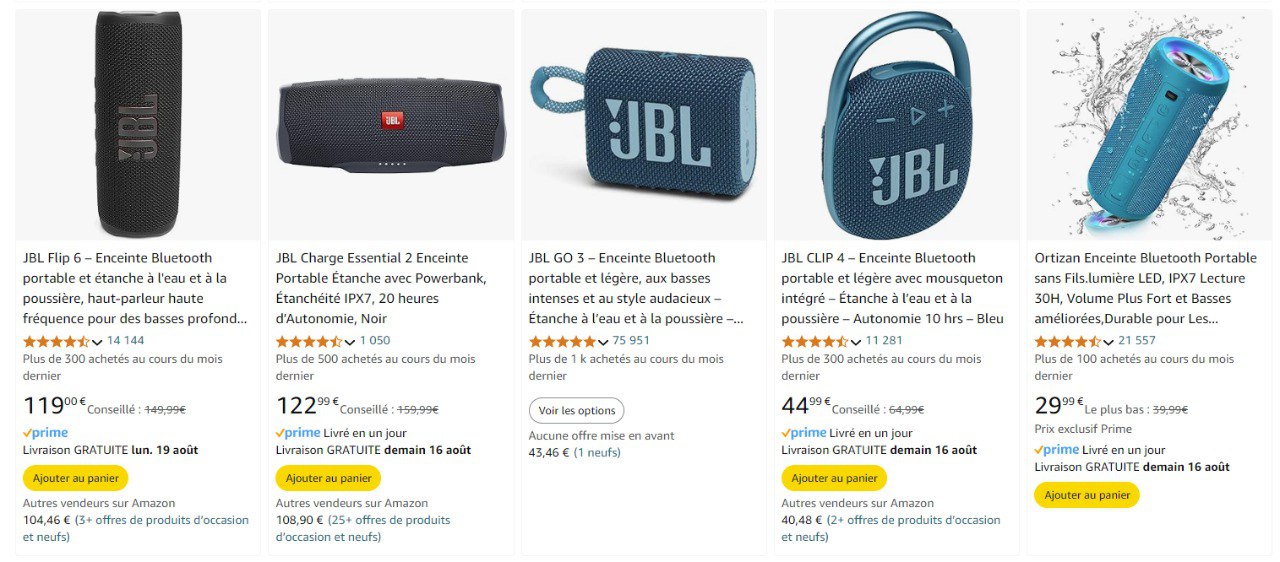
Being equal to other competitive product primary images is not enough to be chosen; a product needs to offer something different and attractive in comparison to the other products available on the results page. In the example below, taken from Amazon for a Bluetooth speaker, we can clearly see that the last product found a good way to communicate that it is waterproof by adding a splash of water around it.
-
Make it square (even if it is not)
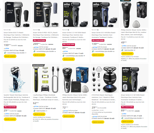
Something important to understand on Amazon is that you provide a picture inserted in the different places where Amazon needs to use this image. In most cases, this space will be square. If you upload a picture on Amazon that is not square, Amazon will make it square by adding a white background color, which is not good at attracting the eyes. This is why it is much better to make a product naturally rectangular to form a square, for instance, with its own packaging. If you look at this screenshot from Amazon you will see that all electric razors that are traditional rectangular devices have added their packaging next to them to fill in the space, if you had searched the same category 10 years ago you would have discovered only the device on its own (like the first product on the 2nd row)
-
Abide by Amazon’s guidelines, but be smart about them
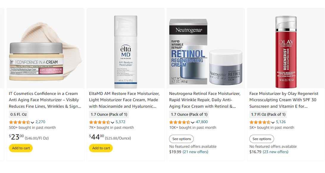
Amazon rules and guidelines differ from other websites and are important to understand so you do not get banned from the platform. For instance, the product should be the first thing shown on the primary image and need to be on a white background. However, we believe it is important to be creative while respecting those rules to make the product as attractive as possible. Looking at the IT Cosmetics main image taken from Amazon, we see that to show the texture of the cream the brand decided to show it behind the packaging. It is a creative way of interpreting Amazon guidelines as the product being shipping is what is in the jar, still the cream shown behind is also the product and is a good way to show the color and texture of the product.
-
Have a clean e-commerce version of your packaging
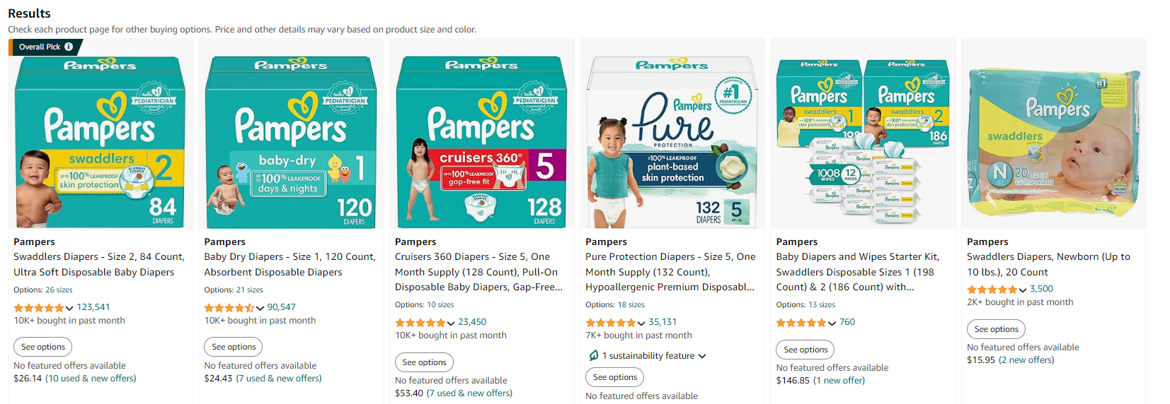
Even if Amazon wants your packaging's primary image to look the same as what they would find if they go to a physical store, it does not mean the 2 need to be identical. Shoppers should not be fooled by what you show on the results page, but you can help them to navigate the store by only showing the critical and even creating a magnifying effect on the elements that would help shoppers to make up their minds. On the example below we see that Pampers remove all non-necessary information and magnify information that are deemed critical to help shoppers making up their mind. If you look at the pediatrician claim in the top right corner, you understand that this is only doable on a digital packaging as this view would not be possible on a real pack.
-
Keep an eye on what competitors are doing
When a product is opened on the results page, it is compared to the other competitors (and their primary image). Thus, it is critical to keep track of what is happening to their primary image to remain competitive. A change that seems minor at first might trigger a snowball effect that has a very significant impact on your product in the end.
Here is how primary images for electric shavers looked seven years ago on Amazon
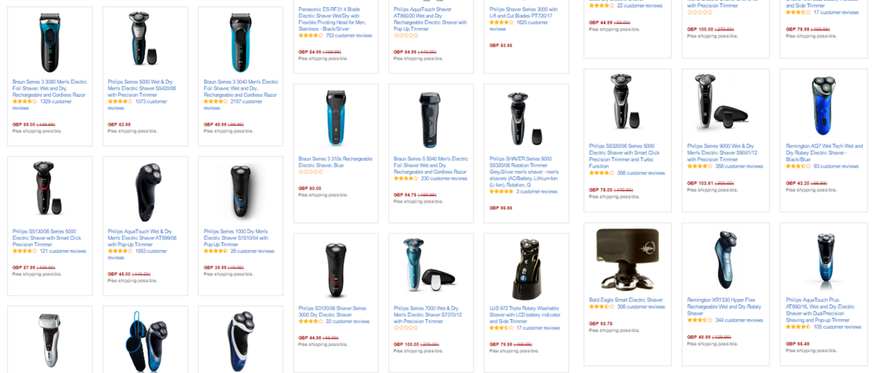
And how it looks now:

Seven years ago, the primary image did not show packaging, and some products showed their accessories without any specific pattern.
In 2024, most primary images now include the pack next to the device, and accessories are used to form a square. From 2017 to 2024, we saw the evolution that led to this page, after one brand experiment and success in creating such primary images.
-
Never stop testing and trying new things.
As highlighted in the previous example, it is essential to keep trying and testing new lay-outs/ ideas for primary images as it is the only way to unveil what works… and what does not. It is very risky to do it live (in case a newly tested option is significantly worse than the previous option it comes to replace). This is why we, at emazing-retailing are specialized in testing primary images in a closed environment so that you can test and learn without putting your business at risk
