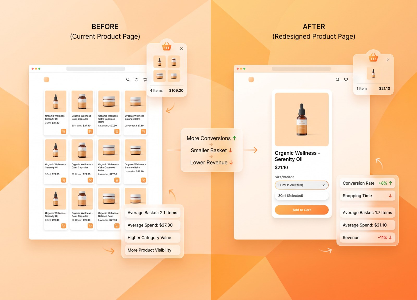
A retailer redesigned the way shoppers pick a size on mobile. Conversion went up eight percentage points. The trip got faster. Shoppers said they liked it. And the category lost 11% of its value. If your test stops at conversion rate, this is the change you would have shipped.
We tested four variant-selection layouts on a US mass retailer's mobile site, across three categories, with shoppers who genuinely buy those categories and no instruction beyond "shop as you normally would". The layouts differed only in how a shopper chooses between sizes, counts and scents of the same product.
One of them looked like a clear winner on the metric most teams report.
The winning number, and the number underneath it
In the laundry category, the modal layout lifted buying rate from 53% to 61%. It also cut the average trip from 109 seconds to 94. Faster and more converting: on a standard e-commerce dashboard, that is a win worth rolling out.
The rest of the picture is less flattering. Average basket fell from 2.1 products to 1.7. Average spend fell from $27.30 to $21.10. Multiply penetration by spend and the category generated 11% less value per hundred shoppers, on 10% less volume.
| Laundry category | Current layout | Modal layout |
| Buying rate | 53% | 61% |
| Average trip | 109 seconds | 94 seconds |
| Average basket | 2.1 products | 1.7 products |
| Average spend | $27.30 | $21.10 |
| Category value per 100 shoppers | — | 11% lower |
More shoppers bought. Each of them bought less. The second effect was larger than the first.
It was not a one-category fluke
The same pattern, with different magnitudes, showed up everywhere we looked.
In facial moisturisers the same layout lost 21% of category value, the worst result in the study. In nappies it looked healthiest of all on penetration, climbing from 82% to 88%, and still managed to destroy 14% of category volume, because basket size dropped from 2.3 products to 1.9. Value landed at +1%: a rounding error bought with a six-point penetration gain.
Three categories, three different penetration stories, one consistent conclusion. Whatever these layouts did to shoppers, it made them convert more readily and buy less.
Why a faster trip can be a cheaper trip
The mechanism is not mysterious once you look at where the products came from. In the current layout, every size and count sat on the shelf as its own tile, so a shopper scrolling the results page passed dozens of them. In the tested layouts, those tiles collapsed behind a selector: total product facings fell 53% in laundry and 73% in nappies.
A shopper who sees fewer products buys fewer products. The speed gain and the basket loss are the same event described twice. The modal was efficient in the way a vending machine is efficient: you get what you came for and you leave.
The brands that paid
Value did not fall evenly. The two largest detergent brands lost between 14% and 30% of their value depending on the layout, and they lost it in every layout we tested. Smaller brands gained, some spectacularly, because a collapsed shelf compresses a big brand's shelf presence far more than a small one's. The brand with 91 tiles has much more to lose from consolidation than the brand with 26.
So a change that reads as neutral at category level can be a serious problem for exactly the brands whose sales fund the category, and it will not show up in a conversion test.
Shopper satisfaction was no help either
The obvious sanity check is to ask people. We did. Satisfaction was high and broadly flat across layouts, and in nappies it actually improved: the new selector was seen as an easier way to pick a size and a faster way to check out.
None of that predicted the value outcome. Shoppers were not wrong, either. The experience genuinely was smoother. Smoother is not the same as more valuable, and asking about the experience cannot tell you the difference. Only the basket can.
What we would take into the next test
Three habits, none of them expensive.
Never sign off a UX change on penetration alone. The metric that decides is value generated per hundred shoppers, which is penetration multiplied by what people actually spend. If a change moves those two in opposite directions, you need to know which one wins before it ships, not after.
Count the facings. If a redesign reduces how many products a shopper walks past, expect a basket effect and measure it deliberately.
And look underneath the category number. A flat category can hide a double-digit loss for the brands that matter most, which is the difference between a redesign the market tolerates and one that quietly costs your biggest supplier a quarter of its revenue.
Our recommendation on this study was not to implement any of the four layouts as tested. Not because the idea was bad, but because the version that won on conversion was the one that cost the most.