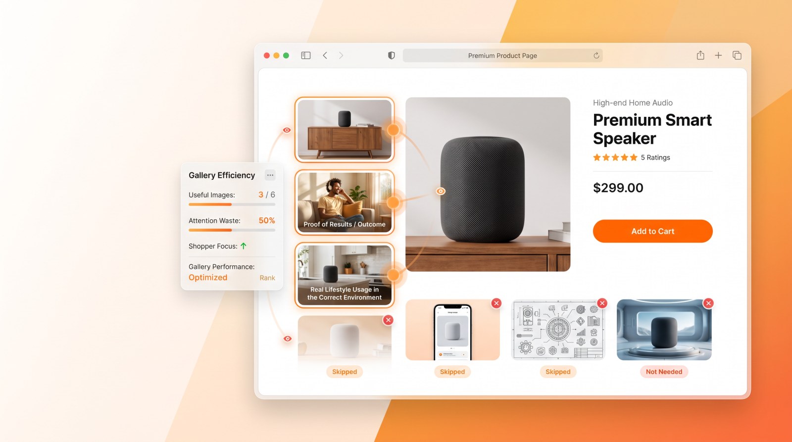
Across study after study, the single most common thing shoppers say about a secondary product image is not that it is unclear, badly designed or unconvincing. It is that they did not need it. On some images we test, a third of shoppers say exactly that. Here is what keeps earning that verdict, and what to do instead.
We ask shoppers, after they have finished a real shopping trip, what they disliked about the images on a product page. The answers are remarkably consistent across categories, countries and price points. Six failure modes account for most of it.
1. The image that answers a question nobody asked
"Not needed" or "not relevant" is the top dislike on almost every image we test, typically between 10% and 31% of mentions. It beats every aesthetic complaint, usually by a wide margin.
The worst offender we have measured was a companion app: over 30% of shoppers called it not needed. They were not hostile to the technology, they simply could not see why a one-off task required downloading anything, and read the whole idea as a gimmick. The rescue was not a better picture of the app. It was to stop selling the app and sell the answer it provides, in that case knowing the right day to act.
2. The engineering diagram
Technical illustrations reliably attract "hard to understand" and "too many icons". A hormone concentration curve, a filtration schematic, a row of five mode icons: each was designed to prove competence and instead created work.
The pattern in the fixes is always the same. Replace the mechanism with the outcome. A filtration figure quoting an airflow rating in cubic metres per hour meant nothing to shoppers; the same claim reads instantly as "purifies a standard living room in fifteen minutes". Same fact, no homework.
3. The clinical cue that frightens people
One product used a red stop light to signal that a step had gone wrong. Shoppers did not read it as helpful guidance, they read it as scary and clinical, and some dismissed it as an unnecessary complication. A close crop made it worse by obscuring what the product even was.
Warning iconography borrowed from medical or industrial design carries emotional freight that rarely survives contact with a shopper. Reframe it as prevention rather than alarm, zoom out so the product is recognisable, and the same feature becomes reassurance.
4. The render that reads as fake
Shoppers are much better at spotting composited imagery than brands assume, and they punish it. In one study the objection was explicit: the product did not sit believably in the room, the scale was wrong against the furniture, and the whole scene felt Photoshopped. The conclusion they drew was not about the image. It was about whether the performance claim beside it could be trusted.
Authentic photography, natural light, correct scale against real objects. Cinematic lighting costs trust rather than buying it.
5. The image set in the wrong room
An odour-elimination image set in a kitchen was called useless and out of place, because the use case shoppers care about in that category happens in the bedroom, driven by sleep and allergies. The image was competent. It was staged in the wrong place, for the wrong job, arguing the wrong benefit, when the category's second strongest purchase driver was sitting unclaimed.
6. Yesterday's innovation
The most avoidable failure. Features that were genuinely differentiating a few years ago now read as the status quo. Shoppers told us a digital display was a normal feature they already expected, and called the image too basic and too simple. It was not criticised for being unclear. It was criticised for being obvious.
When a feature stops being news, an image devoted to explaining it is spending a gallery slot on something nobody needed explained.
What actually earns its slot
The images that win are consistently proof of outcome. Across the studies, shoppers rank efficacy and speed of result at the top, and rank feature-explanation images well below them. Product shots and dimension diagrams sit in an honest middle: low emotional appeal, high practical relevance, and they earn their place by answering "will this fit" rather than by exciting anyone.
A useful sequence follows from that. Lead with proof that the product works. Follow with the one or two features that genuinely differentiate it, expressed as outcomes. Put the logistics, size and packaging, where a shopper who is nearly convinced will look for them. And cut anything whose main defence is that it is nice to have, because a gallery slot spent on a nice-to-have is a slot not spent on a reason to buy.
Why you cannot get this from a survey
Shown a single image and asked whether it is informative, shoppers are generous. Almost everything is somewhat interesting, somewhat relevant.
The verdicts above come from people who had just finished shopping, in a competitive context, having seen the images in a real order at a real size, most of them on a phone. That is the only setting in which "I didn't need this" is a meaningful answer, because it is the only setting where the shopper had something better to do with their attention.